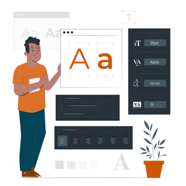
The Art & Science of Typography
The art of using fonts to good effect is a science. You will find plenty of typography articles on the internet if you want to dig deeper, but for web design we need to look at some very specific aspects relevant to web sites.
When a visitor views your web site in their browser the fonts can come from various sources.
- The fonts on their own computer
- Fonts downloaded to their browser from your website
- Fonts downloaded to their browser from a remote site like Google Fonts
It is for this reason that web designers use Font Stacks which tell the browser to use the preferred font if it is available to the visitor and what the second or third choices the browser should use if not.
Fancy Fonts
Before finally deciding on which fonts to use on your web site you need to consider a number of factors.
- Will the font be available to all visitors?
- If not, then which font should be used instead?
- Can I even use that font?
Not all fonts are free. Not all fonts look good on smaller screens. Not all fonts are easy to read.
Font legibility
One of the easiest ways to keep your typography simple is to choose Google fonts with sensible fall-backs that you can live with if necessary.
Websites keep styles across your site matching on every page using style sheets so you do not need to add fancy styles in Word documents you send to us. We only strip them out and rebuild the content anyway.
Stick to no more than three fonts, ideally only two. Within that you have the choice of UPPERCASE, bold, italic and your theme colours to add variety.
For body text you should choose a font which is easy to read. You may want to stick to a basic font such as Verdana which is considered to have good legibility. Googles Open Sans and Lato also work well.
Font Pairings
It is not a good idea to use two different fonts which are not very different. Fontpair is a useful online site which lets you see the typography created by a number of font pairings to help you understand what various font combinations, known as Font Pairings, look like on screen.

